Project context
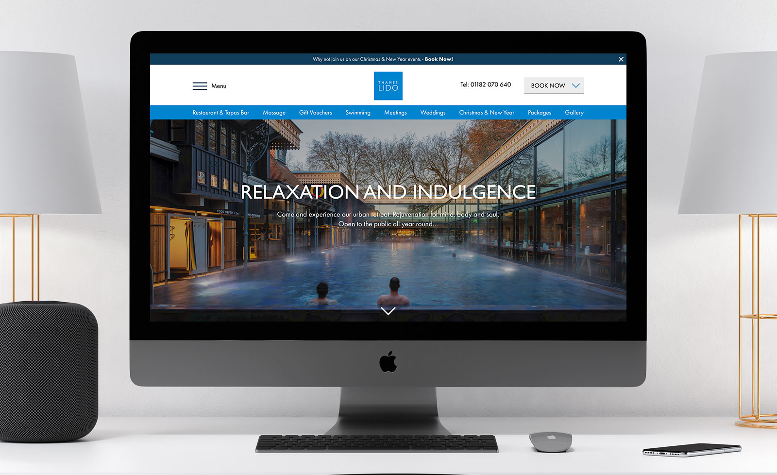
The Glass Boat Company own and run two unique and beautiful Victorian and Edwardian era outdoor swimming pools in Bristol and Reading, the Bristol and Thames Lidos. Both have been restored immaculately from previous run-down states and now serve both members and the public on a daily basis, all year round.
In addition to being able to experience the outdoor pool, guests can sample the restaurant and bar as well as massages and spa treatments and packages. Customers can also purchase vouchers for friends for all of the above.
As so much is on offer at the Lidos, and with three separate external booking systems for customers to use, the websites had grown to be difficult to use. User feedback suggested a great deal of confusion at the navigation and journey, and the result was a progressive reliance on picking up the phone. Something that the Lidos were looking to improve on. The team hired me as Freelance UI/UX Designer in Bristol to help solve these user challenges with them.
Process
Stakeholder meetings and user interviews
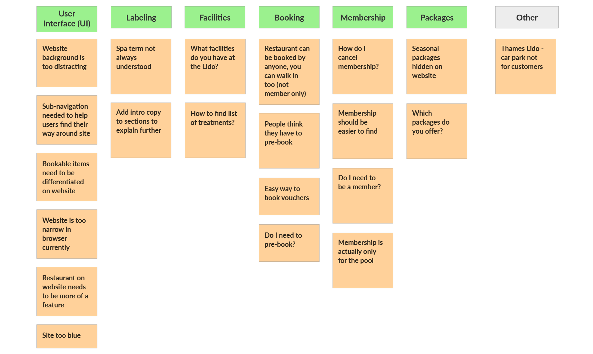
After meeting with the business stakeholders, I began user interviews and collated feedback. This included interviewing the reservations teams who were really at the coal face of the business. They are the people who recieve calls from confused customers on a daily basis, so had very good information regarding the largest customer pain points, and where problems were being encountered on a regular basis. We also carried out contextual interviews with site users.
User journey mapping
We collated all of the user feedback and created a user journey map to analyse. This gave us an indication of the largest problem areas, and what stages of the user journey they were occurring at.
Services Venn Diagram
Understanding the service offering
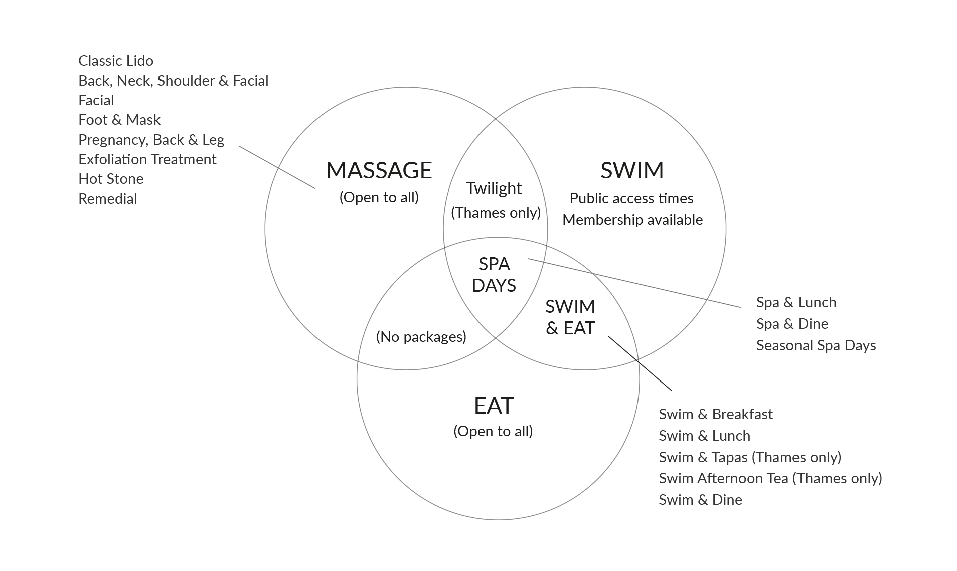
As mentioned previously, the Lido has a number of services on offer for customers, including, swimming, restaurant tables, massages and combination packages. The number of combinations caused confusion not only for customers, but also the owners and staff problems remembering them all, and how they related to each other.
Working with the business owner, we produced a visual diagram to show all of these, and the relationships between each. This was very useful for working out a plan for the Information Architecture (IA), and also for how we were going to arrange information and approach user journeys on the new site.
Venn Diagram of Services
Content prioritisation
Clearly the website provides the ability to carry out some critical tasks, such as contacting the reservations team and finding your way to the premises, but the lido wanted to give particular prominence to gift voucher, spa treatment and book a table features. These three aspects of the business are the most lucritive, so it was imperative that they were quick and easy to find on the new website.
Card sorting
We carried out simple card sorting exercises with site users to help decide on the best terms to use for navigation items, particularly around the theme of spa, treatments, packages and massages which tended to cause a lot of confusion.
Information Architecture (IA)
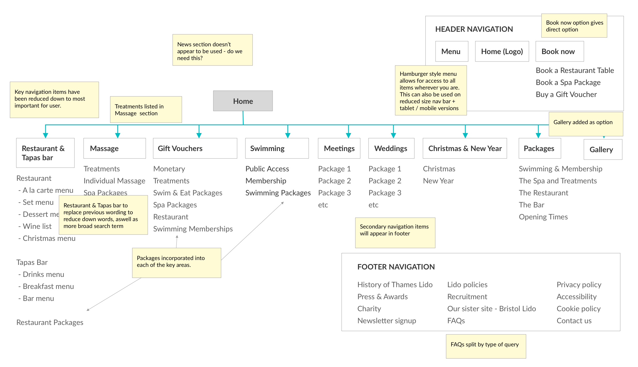
The result of this research was to create a new IA for the websites, which promoted simpler user journeys and more obvious terms for services, as well as quicker navigation with fewer clicks / taps.
Information Architecture (IA)
Wireframing / prototypes
I then went on to create clickable prototypes to allow users to navigate through some key tasks. Through observation, we refined and improved these until we were happy the quality had been improved to a high enough degree.
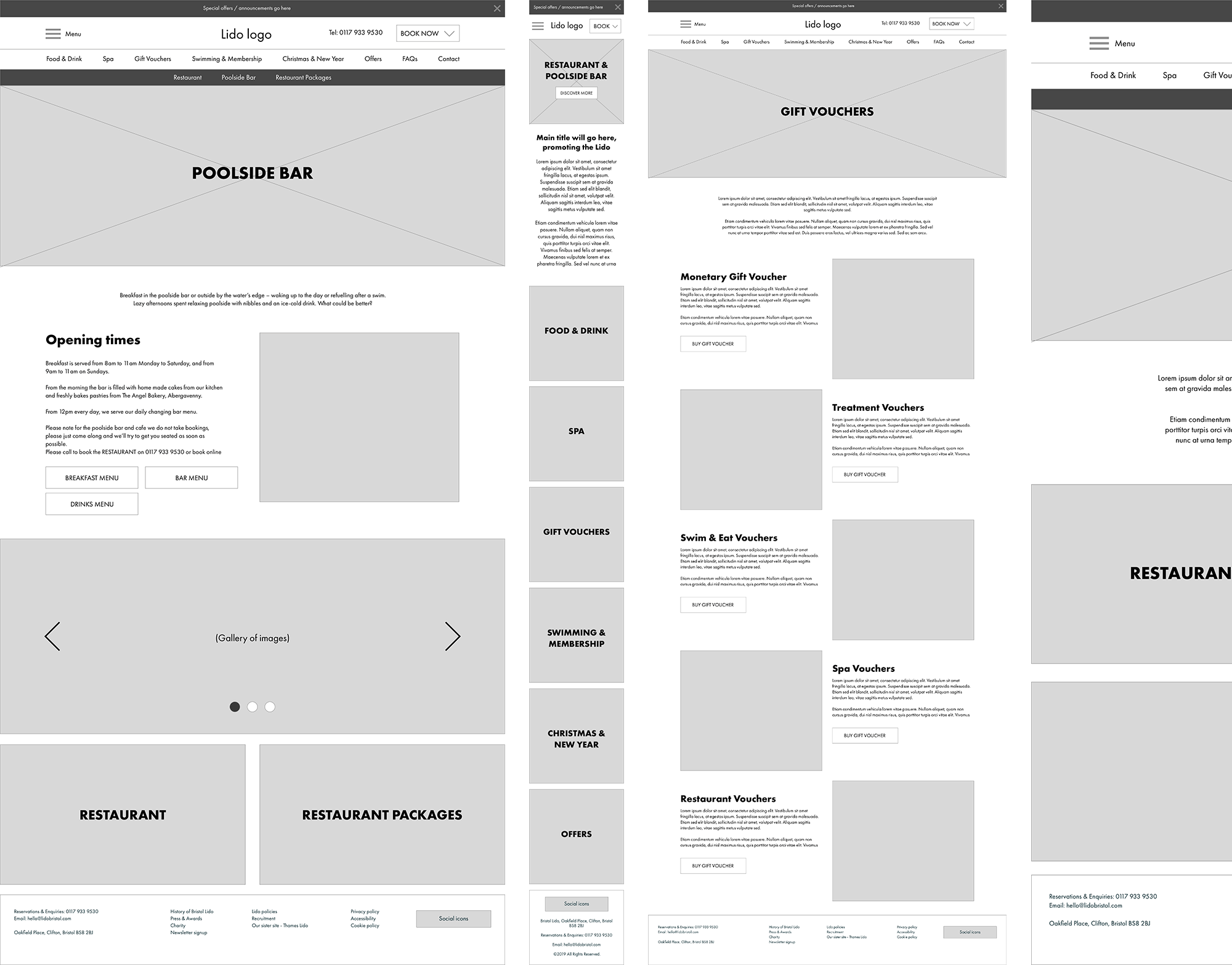
Wireframes
Solution
After working through the prototypes, I moved on to full UI designs in Sketch. These were designed for high-retina displays, and responsive versions for mobile were also created.
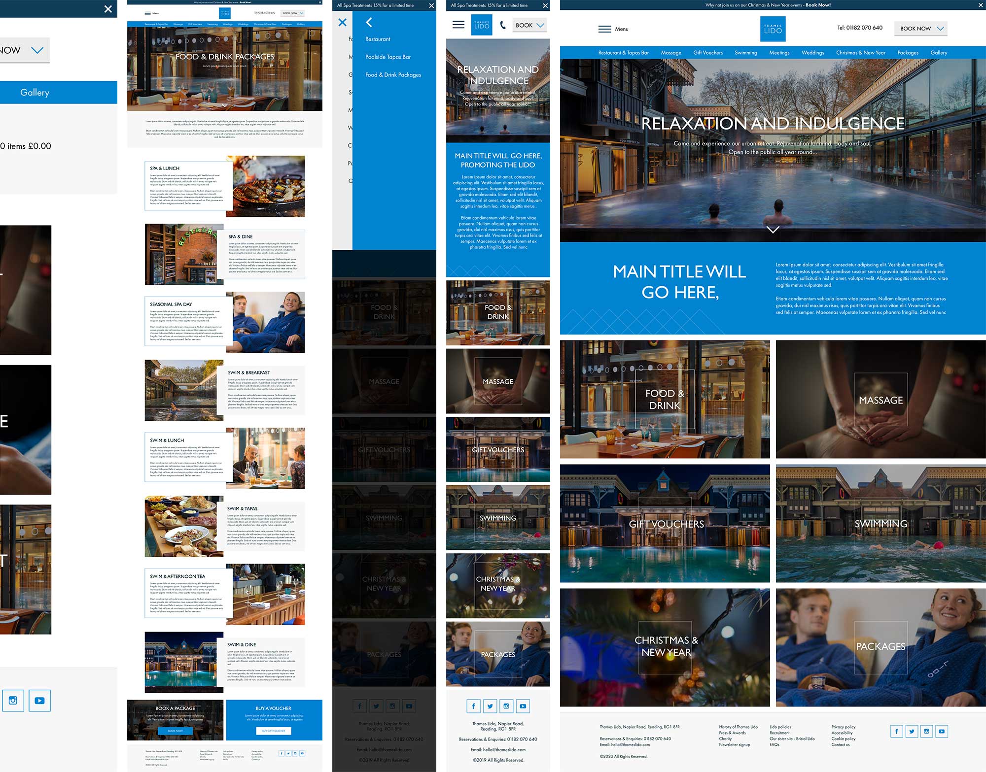
Lido UI Designs
Quick navigation was created allowing users to access the defined red route items from above.
Feedback from the team and research users has been extremely positive, and the site is now in development, we keenly wait for the live results.
