How I worked with The Headteacher’s Report to help improve the user experience of their software and make it more intuitive and desirable to use.

“Saving headteachers hours in report writing time every term.”
The Challenge
The Headteacher’s Report, or HTR as I’ll refer to it, has developed an online application which allows headteachers to quickly create reports for use in their reporting duties to Offsted, school governors and other stakeholders.
The reports use automated tools which allow them to be filled with information from their MIS (School Management Information System), the Department for Education and other sources.
However, there was a general perception that the user interface and experience was cluttered and difficult to use and navigate. It was a classic case of software functionality being added in an ad-hoc way, but without enough time invested in the overall UX.
Currently, there are no direct competitors in the market, so HTR is very aware that they need to create software which continues to innovate as well as being a great user experience!
Initial perceived issues:
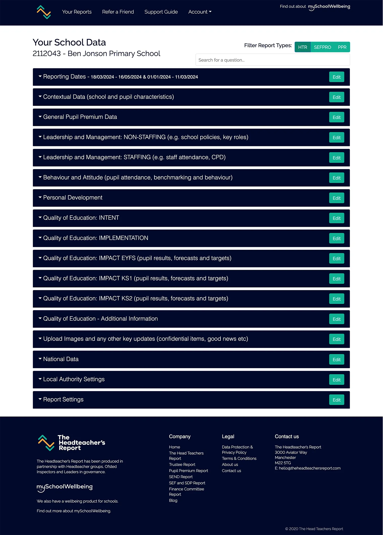
- It was felt that the current interface was too busy and cluttered
- It was effectively a long list of information which was hard to interact with
- It was not immediately obvious which reports a user had signed up to, and which they had not, we wanted to make this more obvious
- Cross selling of un-purchased reports could be improved
- The long lists of accordion interactions were intimidating for the user (also they might not have realise that they didn’t have to fill in all sections of the report – as most info is pre-populated)
- Text input fields were small and users were forced to use word processors to create copy and then paste into the interface
- The saving method using one of three buttons (save and next section, save and previous section, Save and Review, Save and Download) was confusing / buttons were hard to locate once editing info
Screenshots of existing software



Research
User interviews
Although we had generated hypotheses on possible user experience issues with the current software, the only true way to validate these was to carry out user testing. We decided to combine these with user interviews at the same time in order to maximise efficiency.
We identified our ideal user as:
- Current serving headteacher or retired headteacher with relevant experience
- Experience in writing headteacher reports for stakeholders
- Experience in using HTR’s software to create these reports
- We also wanted to compare with users with no experience of using HTR’s software to create reports
Some questions I asked users during the interview
- Describe how you have generated headteacher reports in the past?
- What software have you used to create these?
- How have you stored these reports?
- What were the most important aspects for you to consider when creating reports in the past?
- Did you compare various options?
- Can you remember which tools/software you compared?
- Overall, how have you found the process of creating headteacher reports in the past? Is there anything you would do differently the next time?
Usability tests
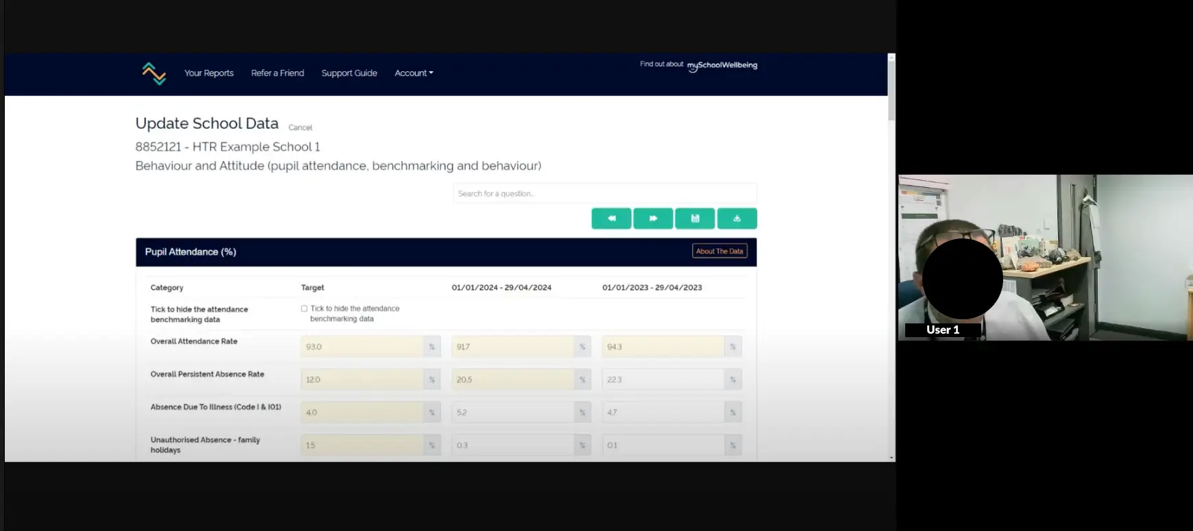
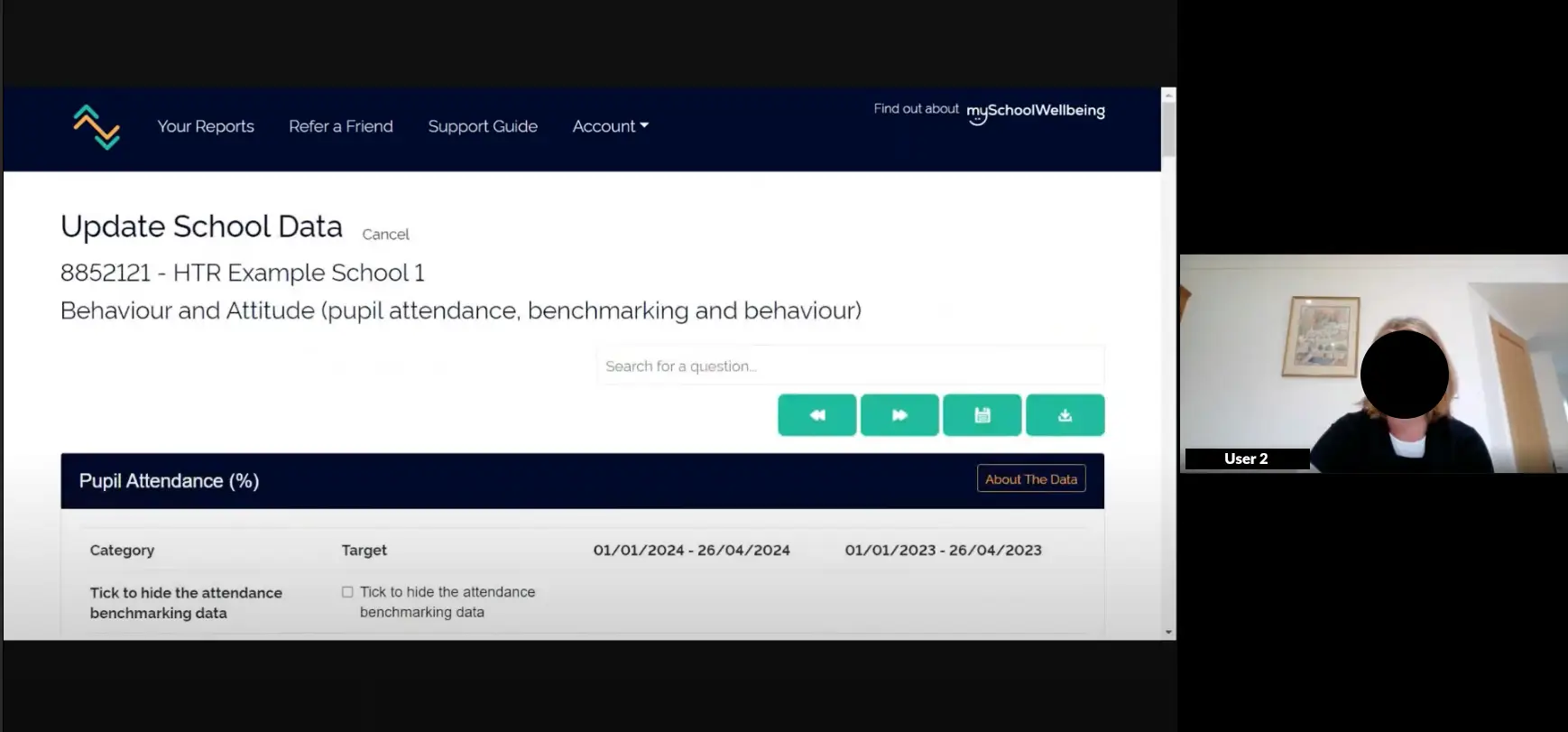
I developed a script for usability testing, this asked the users to perform a series of tasks designed to test the key areas of the software that were causing negative UX issues.
Tests were conducted on a remote basis and involved two users – one a serving headmaster who was familiar with the HTR software, and the other a recently retired headmaster but with no experience of the application in question.
This led to some very insightful observations, which were noted after reviewing the recordings.
Analysis
Affinity diagramming
In order to make sense of the ‘messy’ data observations, we conducted a remote affinity diagramming session. This led to the following groupings of observations.
This work was very valuable as it validated some of our previous perceptions, but also uncovered some new challenges to solve.
For example, we were unsure if users fully understood the three separate saving buttons within the software and what they were for. This proved to be fairly obsolete in the end though as user 2 actually completely missed them and once updating particular input fields, used the browser back button to navigate back to the reports screen – losing all the entered data at the same time!


The Solution

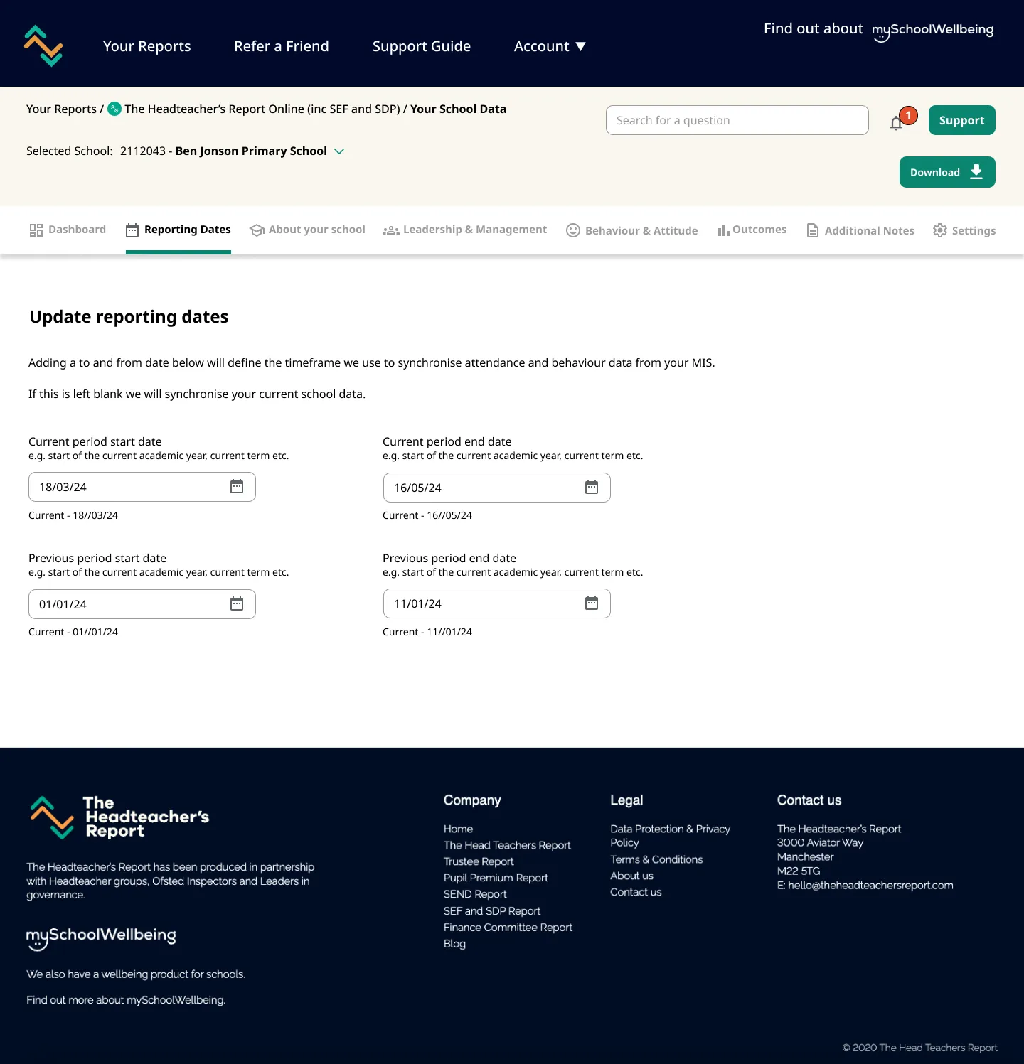
Here’s the project before work commenced and after the UI/UX design work (Drag the vertical slide bar to slide between designs).
Reports page
In order to make the reports page more intuitive, we changed the layout from using accordion controls, to more of a visual dashboard layout, with every report contained within its own panel. This allowed us to make use of the current report ‘badges’ which then visually linked the reports with their branding.
For each report panel we made the view/edit buttons prominent as this was the most common use case. Secondary goals such as emailing reports and downloading reports were displayed as icons – easy to access but not fighting for the user’s attention.
Additional reports were added to a section of their own, making it more obvious that they were reports not purchased yet. We also split the main buttons into ‘Sample’ and ‘Order Now’, as each function had equal importance to users.
Further information could now be accessed through the info icons at the top of the report panel.

A key improvement was to display a visual dashboard to the user when they accessed one of their reports. This gave them key data at their fingertips and allowed them a top down view of all their important information.
Also key, was the improved navigation system and information architecture. We created categories for the main groupings of the reports and allowed these to be accessed via a horizontal menu. Each group now has its own icon as well as obvious active state.

Where groupings have sub-groupings, we introduced a vertical navigation area to allow the user to quickly switch between these. This meant that a user didn’t have to lose context with their place within the user journey – unlike the previous experience with effectively sub-pages for each report area.
We also looked at creating a more cohesive colour scheme, which also made the content more readable and less stark.
Use of info icons with tooltips de-cluttered the interface, and we made more a feature of AI controls, and explained their function in a more intuitive way.


Input fields have been made wider on desktop / tablet devices and can be enlarged by the user, making data entry more easy.
Together we agreed to implement auto-saving, which completely negates the need for save buttons which were a source of frustration and confusion previously.
The new designs are being implemented as we speak, and I continue to support the development team with asset output and any explanations required.

What the client said...
“By taking us through a comprehensive UX process, Mark has helped us to improve the user experience of our Headmaster's Reporting software and make it more intuitive and desirable to use. We would recommend Mark's skills to any company looking to hire a UX Designer.”
Neil Charlton-JonesCo Founder of The Headteacher's Report
