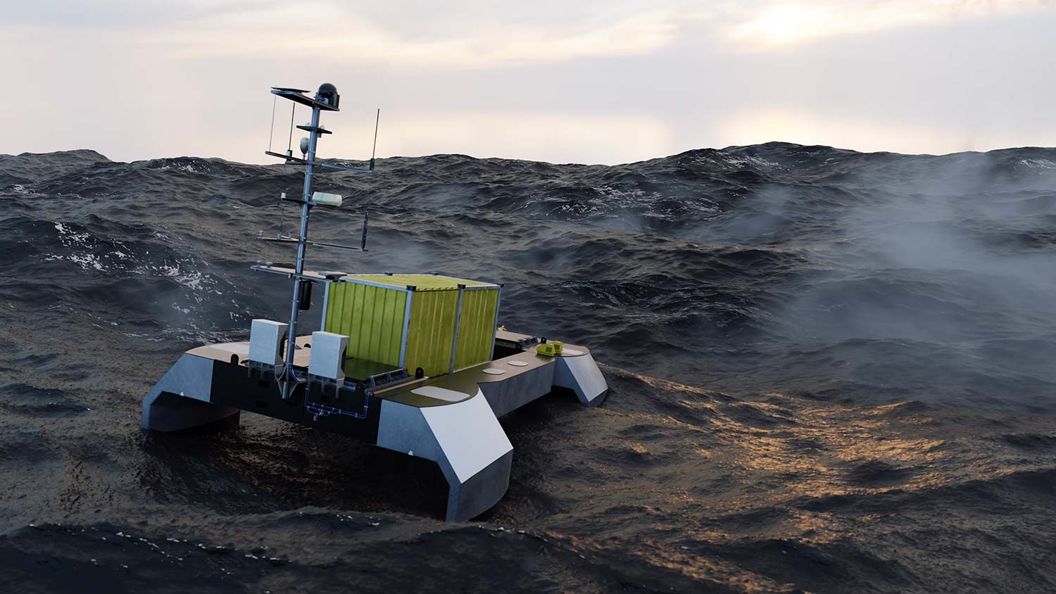
Design of navigator and engineer interfaces for this sophisticated sea vessel.

Zero-emission maritime autonomous surface ship UI control systems
Project context
ACUA Ocean are in the process of designing, developing and deploying high-powered USVs (Uncrewed Surface Vehicles) which will be used for ocean monitoring and protection.


These zero-carbon emission vessels contain sophisticated monitoring equipment which allow them to capture a wide variety of data for economic and environmental management of oceans, waterways and critical offshore infrastructure. They can operate for up to 40-60 days at 4 knots on projects.
Each of these vessels will be controlled by a navigator and an engineer, to ensure their safe operation on the open seas.
Challenge
ACUA Ocean’s USVs are designed to operate in ‘swarms’ (multiple vessels simultaneously), controlled remotely by navigators and engineers from Remote Operating Centres (ROCs) on shore. Each team could potentially deploy and manage 1-7 vessels in the ocean at any one time and would need to be in full and safe control of all of these at all times.
Any designs would also need to be approved by Lloyd’s Register who are a leading provider of compliance services for the maritime industry. Therefore an easy-to-use interface with intuitive logic and simple user-journey was paramount. As with all projects, UX standards were just as critical to success as UI design.
ACUA Ocean had created basic wireframes internally for the engineering and navigator aspects of the vessel, but needed these developing into working prototypes all the way through to high fidelity designs which could be implemented for real, using the final control systems.
The solution
Building the context of use for this project was particularly important. The final user interfaces were going to be deployed on high resolution monitors with designs spread over multiple screens. These would be situated in an ROC (Remote Operating Centre) which incorporated low level lighting in order to minimise glare on screens.
To embrace this, we decided to create designs which were predominantly dark in terms of backgrounds for the user interface elements – a ‘dark mode’ look and feel. This meant that buttons, text and various components would be prominent and easy to view for users in a dimly lit room, as well as minimising eye strain in the ROC conditions.
Engineer screens
The UX for the engineer screens was based on a horizontal and vertical tab system. The horizontal tabs being utilised for the vessels under command and the vertical tabs for the engineering systems. This felt like a logical user experience as it ensured a quick path to navigate to individual vessels and systems in a minimal amount of time and clicks. It also meant we could fit a large amount of information on a screen at any one time.
To help with visual sign-posting, I designed icons to represent each of the engineering systems, and incorporated thumbnails of each vessel so that users would contextually be able to confirm where they were within the systems.
Another device I introduced was to incorporate a 2D representation of the vessel under command within every engineering screen. This meant that we could visually map systems to the vessel, which was particularly useful when highlighting any warnings or emergencies which could arise. Again, the production of icons allowed colour coding for the various stages of warnings as a quick visual display to the engineer.


Navigator screens
Again, the navigator screen used by pilots was based on basic wireframes provided by ACUA.
One of the key principles in the design was to ensure that the main interface was not overly obscured by the UI, as having maximum visibility of the view through the various cameras was paramount to ensure safe navigation through the water systems.
Controls and indicators were therefore housed in a panel which was anchored to the bottom of the screen, with a central console housing key navigational tools.
The USV incorporates two side and rear-facing cameras to allow 360 degree views. To allow the user to benefit from these views, without obscuring the main user interface, I designed camera views which could be switched on/off as well as expanded/contracted as required.


Through user testing and human factor workshops with LR, we later decided that these extra camera views would be even more useful if visible at all times, we therefore incorporated these on completely separate monitors within the operations centre, giving an all round view to the navigator at all times.
These designs were then taken a stage further and transformed into real time simulations by a third party, to allow various situations to be simulated and tested.
ACUAs first hydrogen powered USV is well into development and looking to deploy in autumn 2024 – we’re all very excited to see this happen!
What the client said...
”“Mark’s UX and UI experience has been absolutely invaluable in transforming our initial ideas into fully designed prototypes that have allowed us to take our project all the way from concept to commercial implementation.
We are extremely impressed with Mark’s quality of work as well as his attention to detail and professionalism, we’d recommend his services to any company looking to employ UI/UX expertise on their projects. We look forward to working with Mark again in the future."
Neil TinmouthCEO ACUA Ocean
