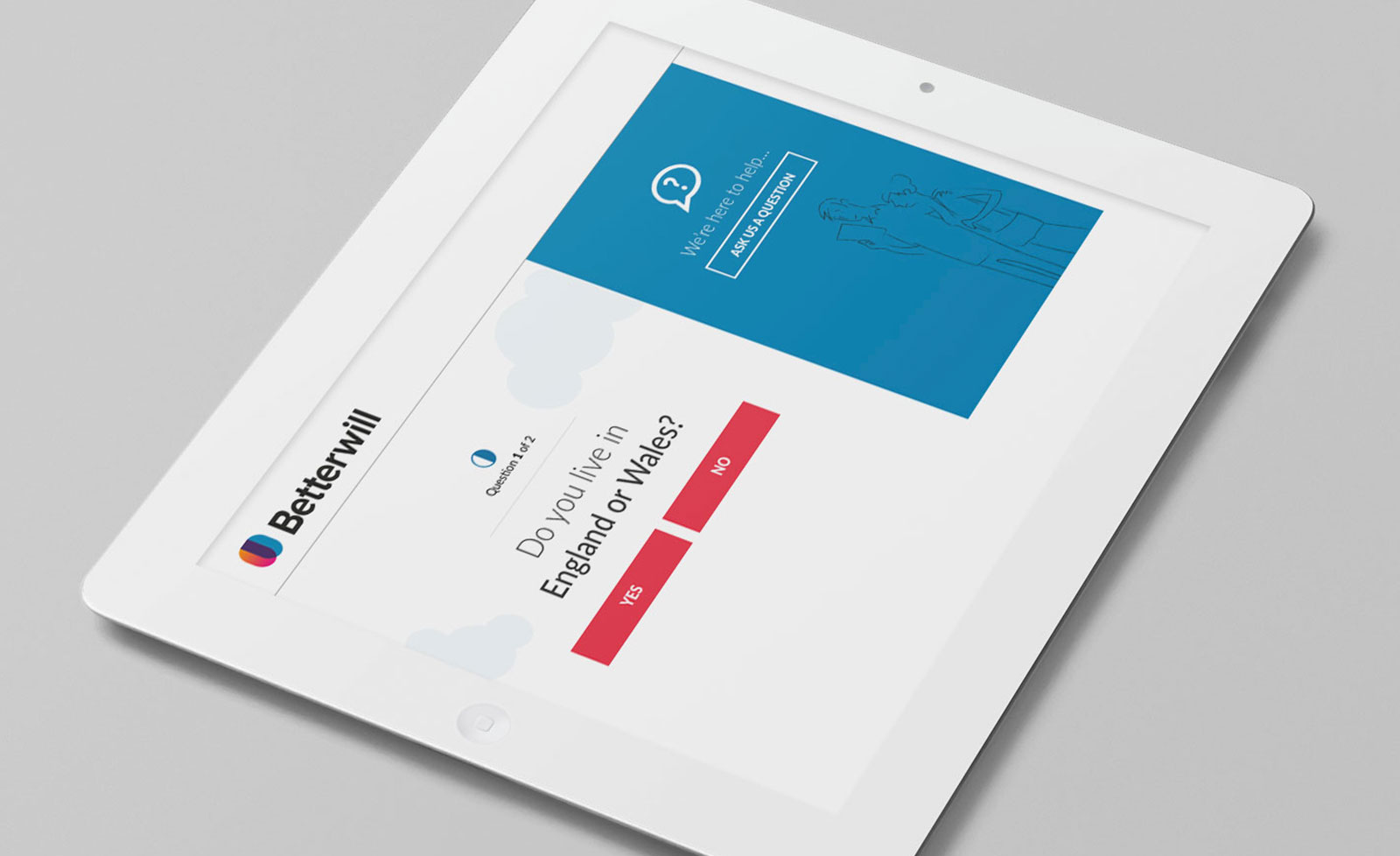
Project context
Betterwill were looking to create an online application, designed to disrupt the market for creating your own wills. Traditionally of course, the process of getting your will drawn up has always been handled by high street solicitors, and is carried out in person. It can be a daunting, formal process.
Betterwill wanted to offer users the ability to create wills online for users and their families in a matter of minutes. This would not only make the process quicker and easier, but would also be potentially saving them hundreds of pounds compared to the solicitor method.
The aim of the project was to take some of the fear and apprehension out of creating a will.
‘An easy, online, tool that allows users to create, manage, and download a professional will for an affordable price.’
There were two aspects which required design here:
- The information website which explained the proposition and provided credentials and reassurance for the user
- The on-boarding process web app, which step-by-step, allows the user to add all of the information required to create their will. This would also need to filter out any users who were not actually eligible to use the app (e.g. if you lived outside of England or Wales).
As well as these, we required interfaces to store user account information, lists of wills and payment history.
Process
The team at Betterwill had an idea in their heads for the information the user needed to provide, but were unsure of the best way to present the information, what the user journey should be, and what the interfaces should look like. As well as assisting with all of these areas, the client also wanted help with the branding and user interface design for the finished product.
Research
Betterwill had carried out some research prior to our collaboration. This included signing up as users to the market’s most dominant existing providers of online wills. They then effectively carried out user testing on each, collating feedback and working out the strongest and weakest features.
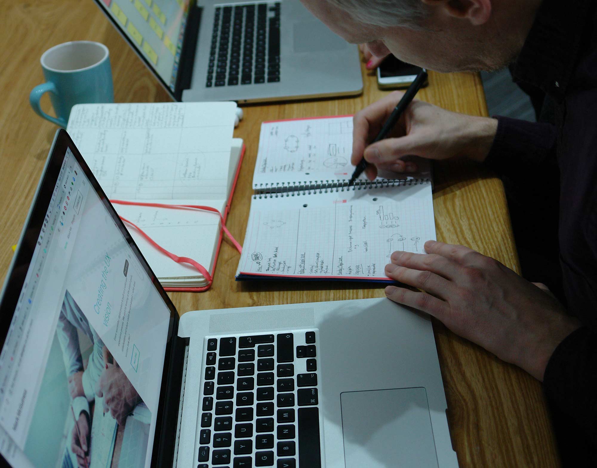
UX Research
Information Architecture (IA)
Once we had established functionality, we put together the a site map for the application, this was very useful as it gave us a bird’s eye view of the project, and also the user journeys that needed to be considered.
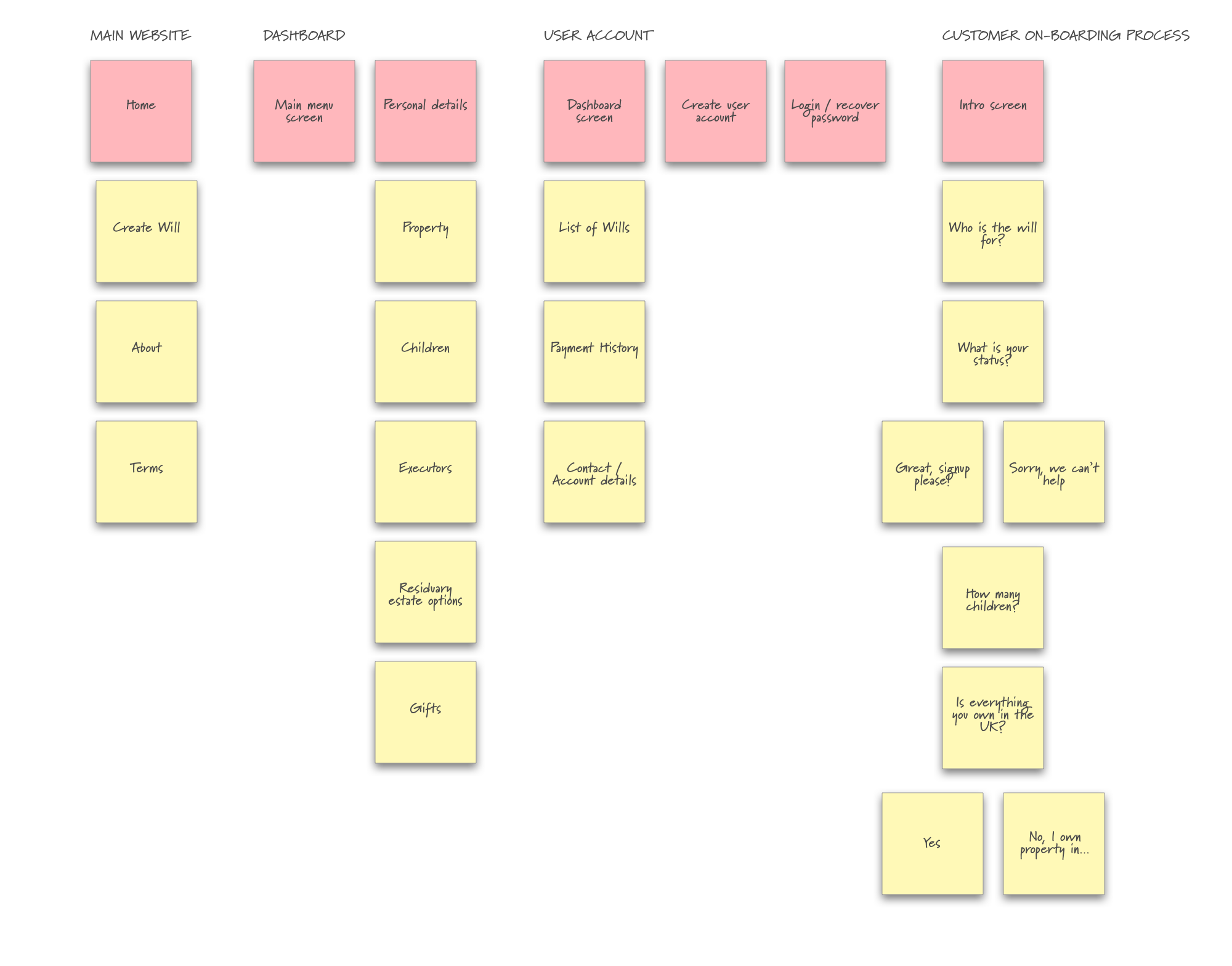
Site Information Architecture (IA)
Wireframing / prototypes
We created wireframes of all of the screens required, and then linked them together as a working prototype so that users could click through as if using. Feedback was then used to iteratively update these wireframes in order to make a more usable product.
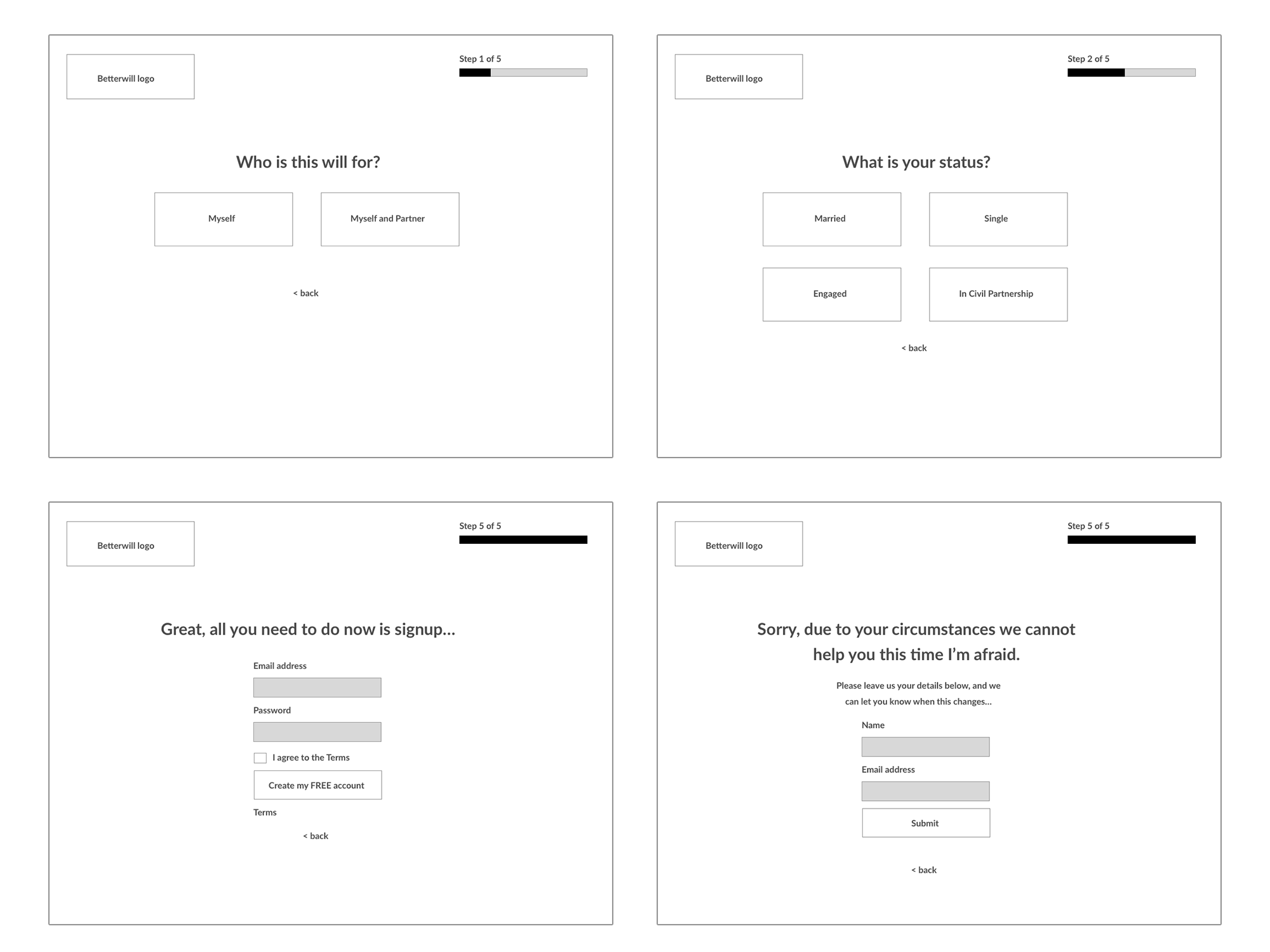
Client on-boarding wireframes
The prototype was particularly useful in the on-boarding process and dashboard for the product.
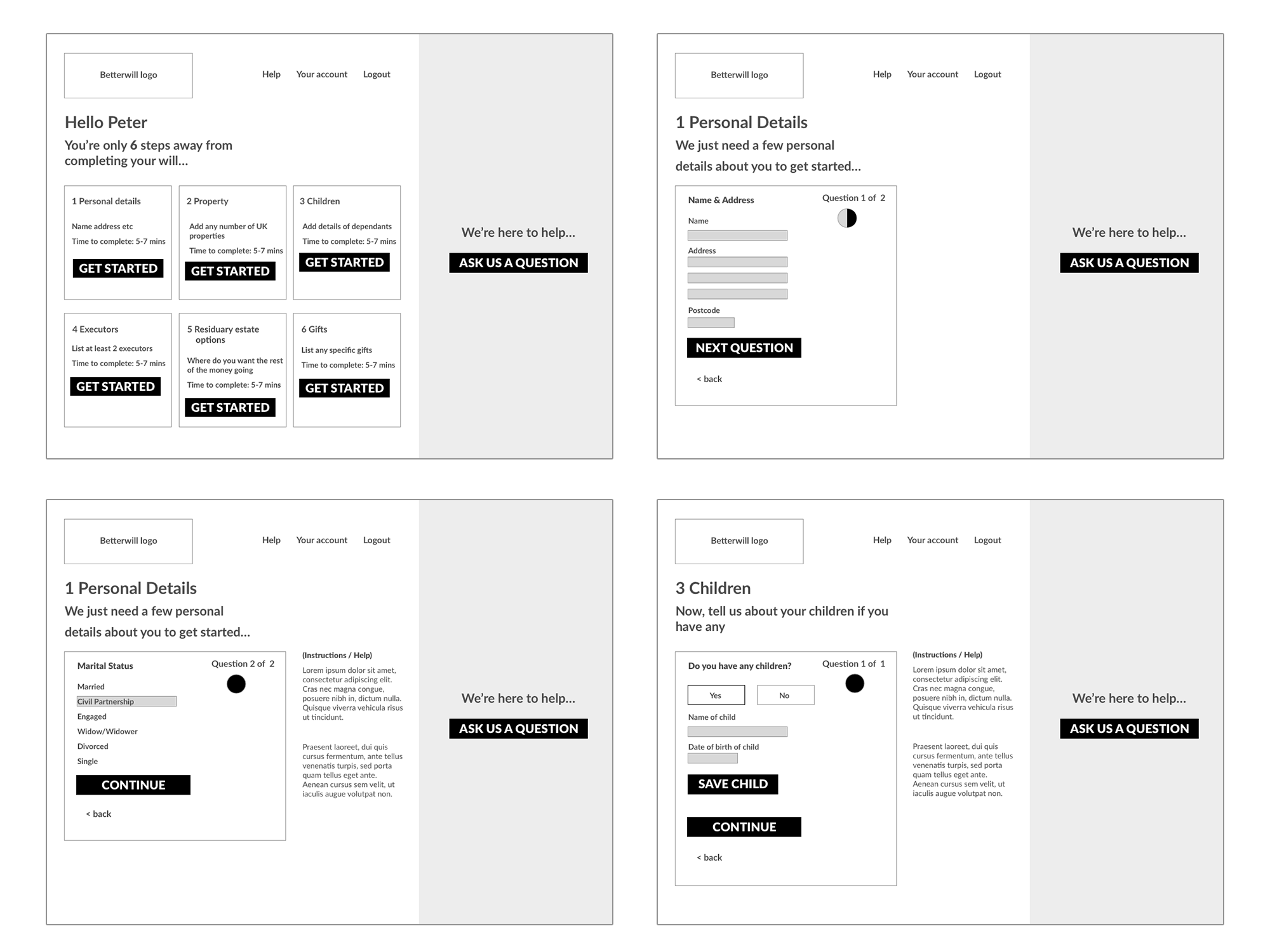
Betterwill customer dashboard wireframes
Solution
Once we were all happy with the functionality and experience of the prototypes, the task of creating full UI designs started.
The use of colour was important in order to make it obvious when a user had completed a particular section (highlighted in green), and also where sections had been previously started but in-complete (half-circle icons).
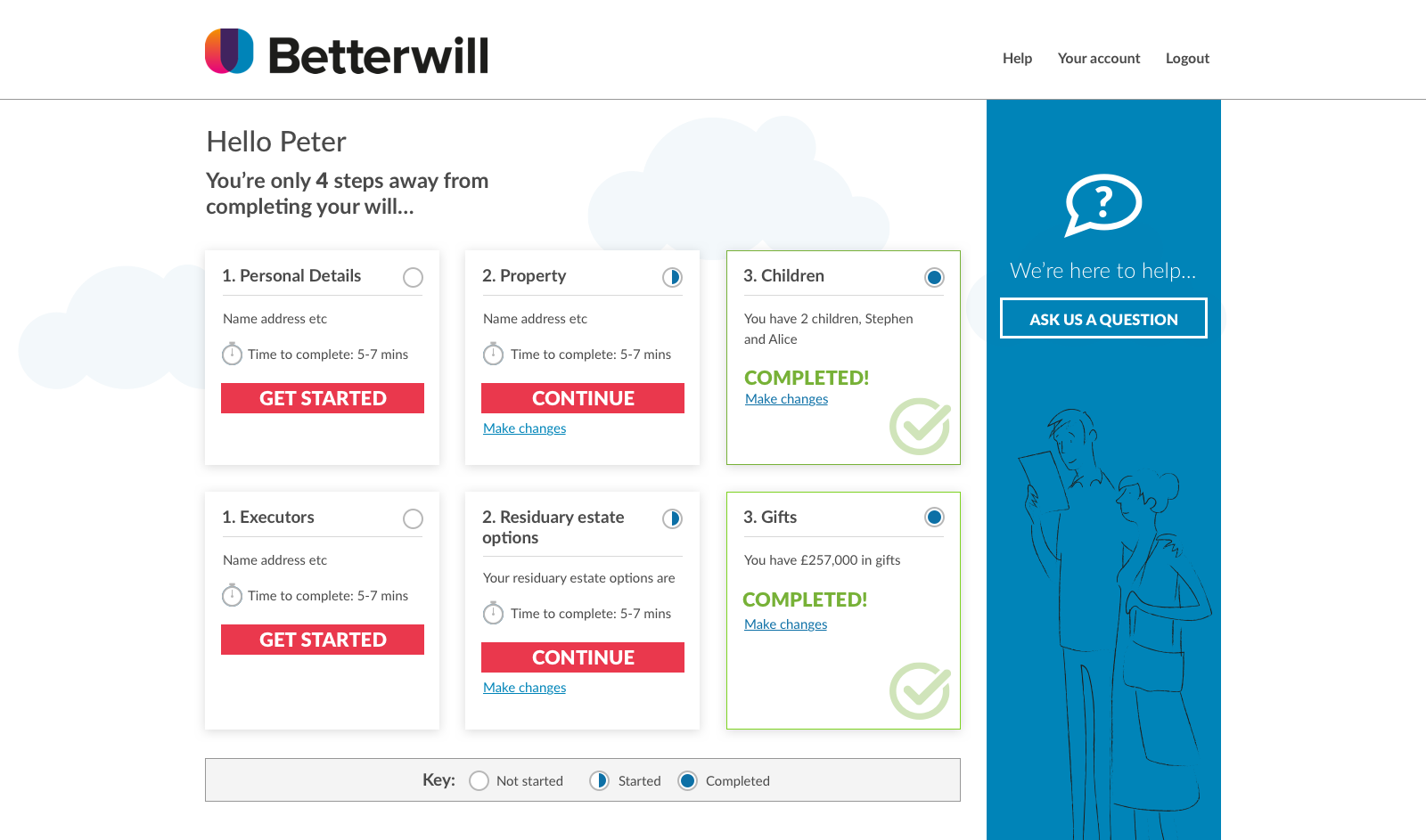
Betterwill dashboard design
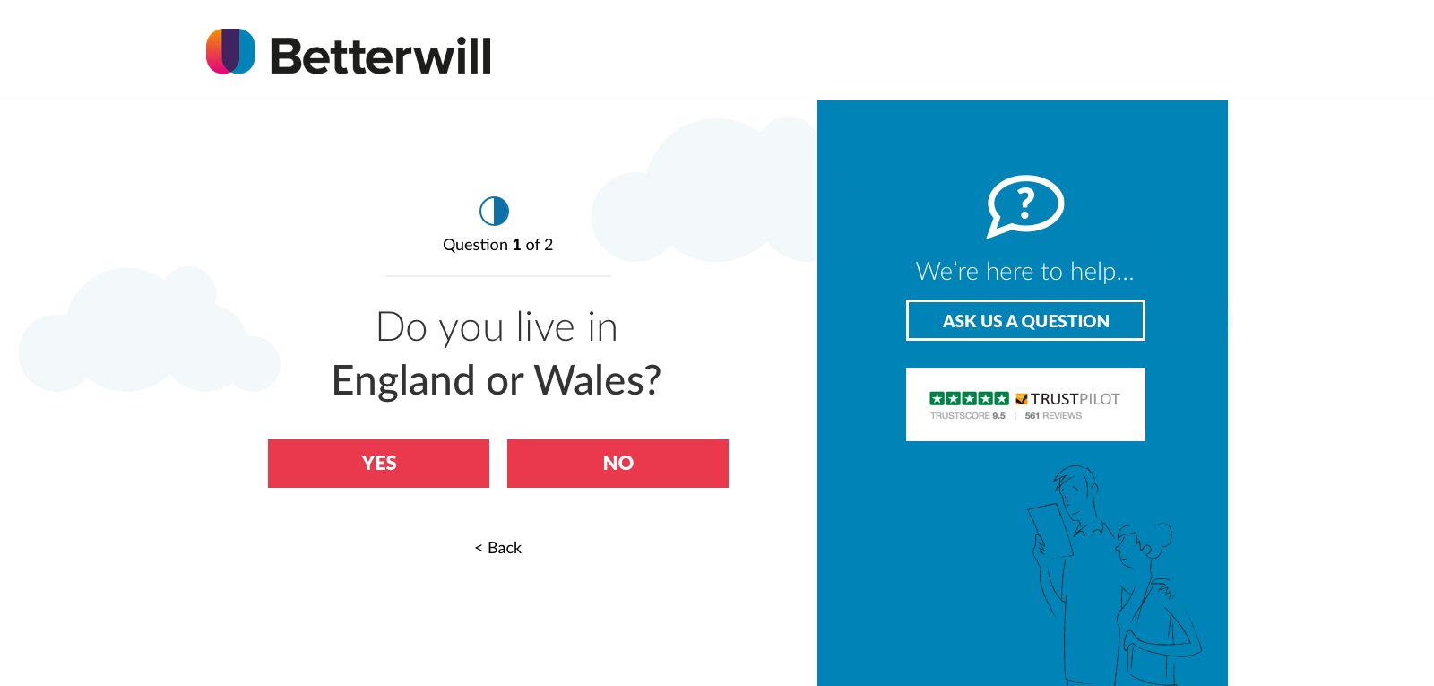
Customer on-boarding user interface (UI) design
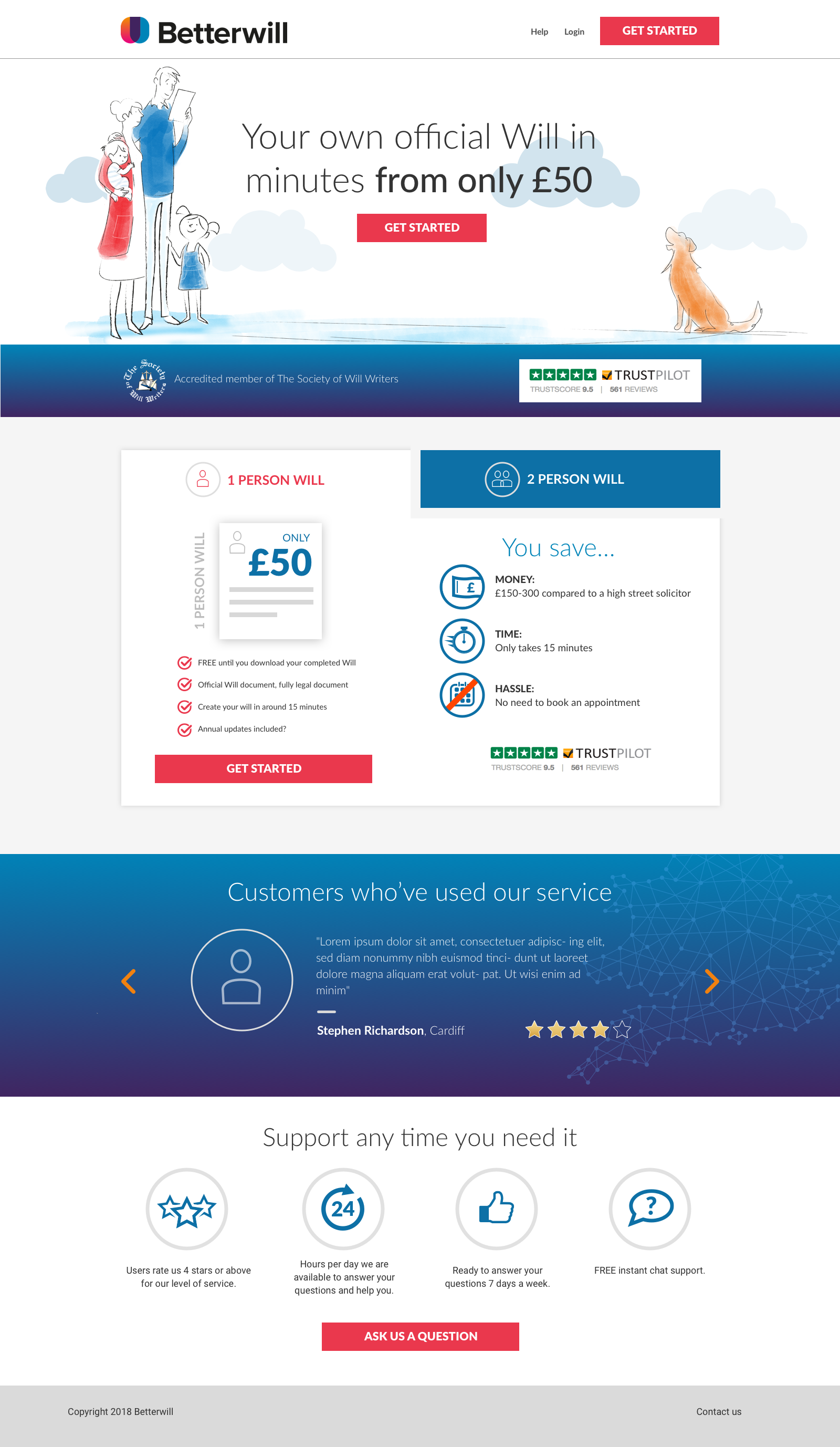
The website home page
