Project context
32 Squared specialise in generating quality leads from creative campaigns at a large scale.
In this latest project, they wanted to design and launch a whole of market comparison website which would capture details from customers looking to mortgage or re-mortgage their homes. These leads would then be passed to expert mortgage brokers who could talk customers through the best deals for them.
Process
The client had a mortgage comparison tool which had been used successfully on a couple of previous sites, so we were going to be re-using this. The task then was to create a simple user journey along with a clean design and modern branding to ensure that the user felt comfortable enough to actually use the comparison feature here.
Part of this was to reinforce the fact that this was a whole of market comparison, and included all the top high street financial institutions.
Research
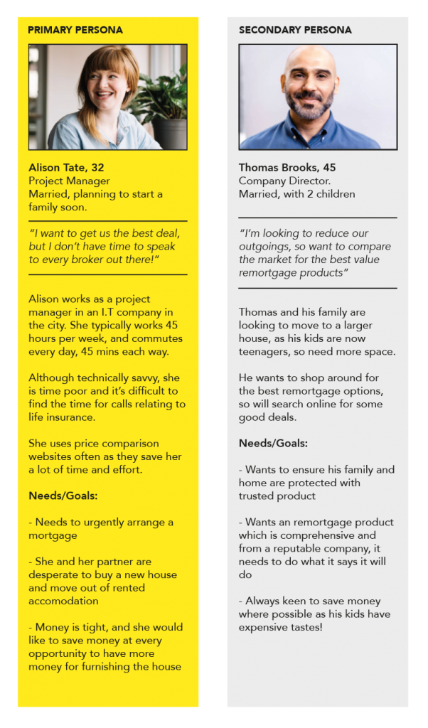
Working with the client, we created two personas to represent the key user groups.

Primary and Secondary personas
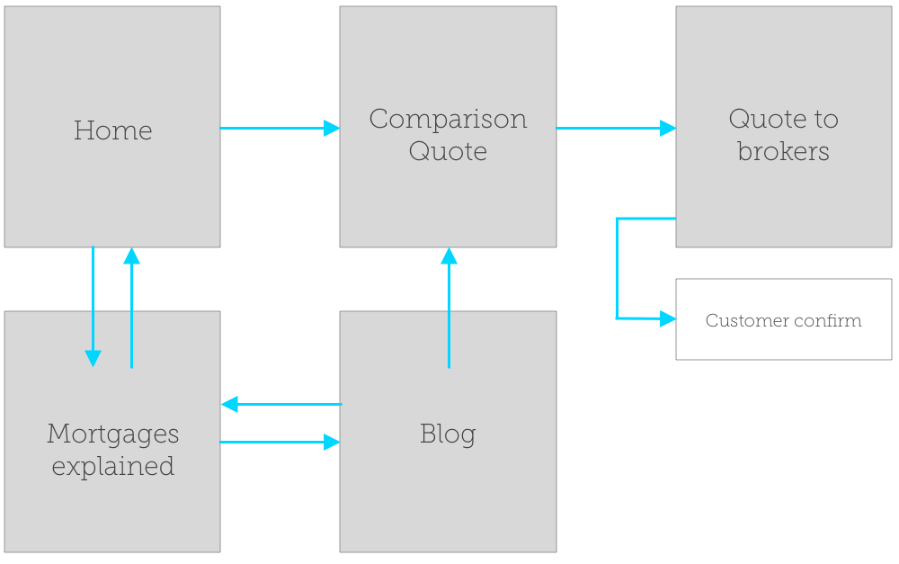
User journey
I created a user journey to show the step by step process to reach the mortgage comparison tool. Once the tool was reached, all navigation controls were removed. This was to remove any distracting clutter and to focus completely on the task at hand.

User journey
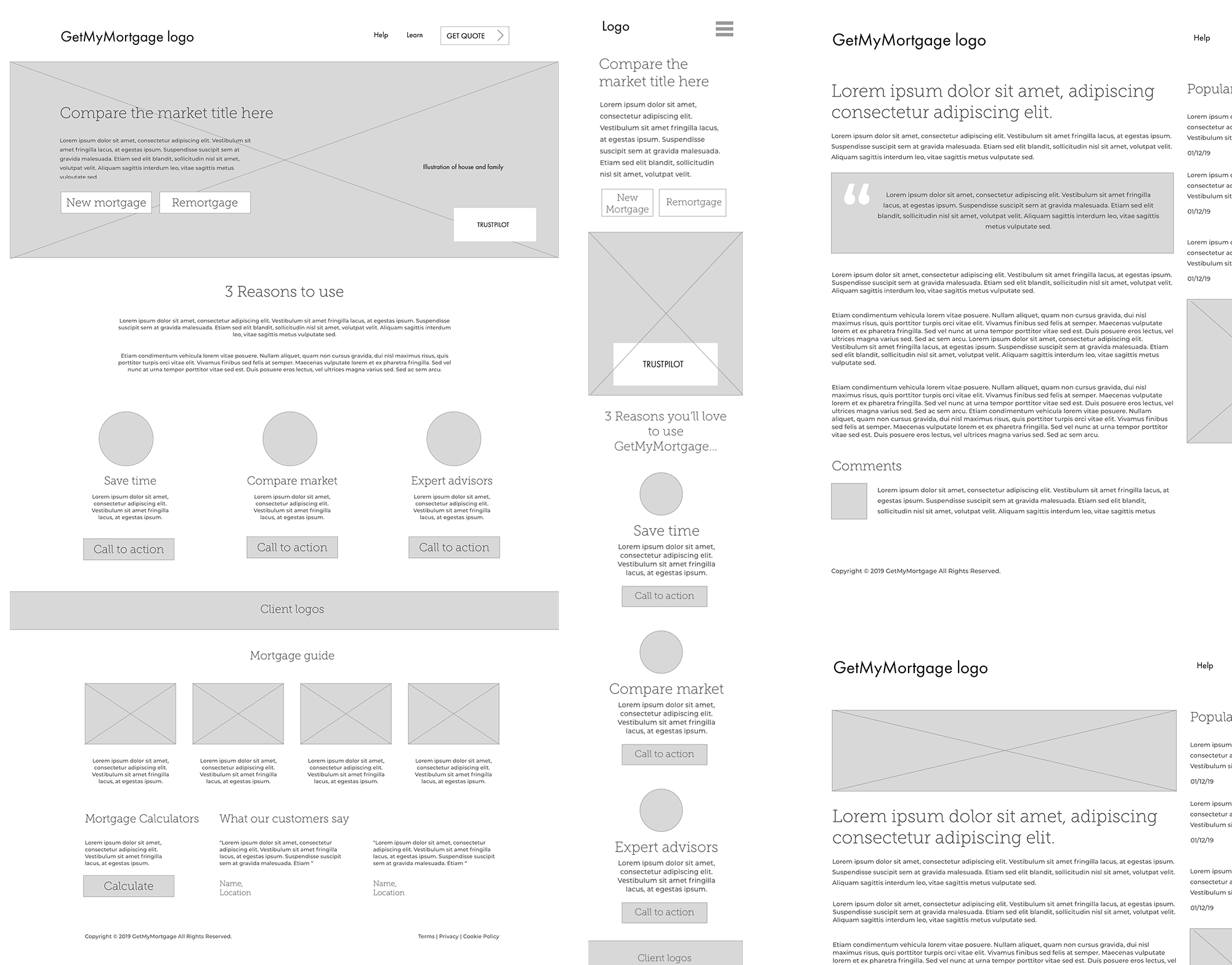
Wireframing / prototypes
I then put together basic wireframes for the site pages including desktop and mobile versions.

Wireframes for desktop and mobile
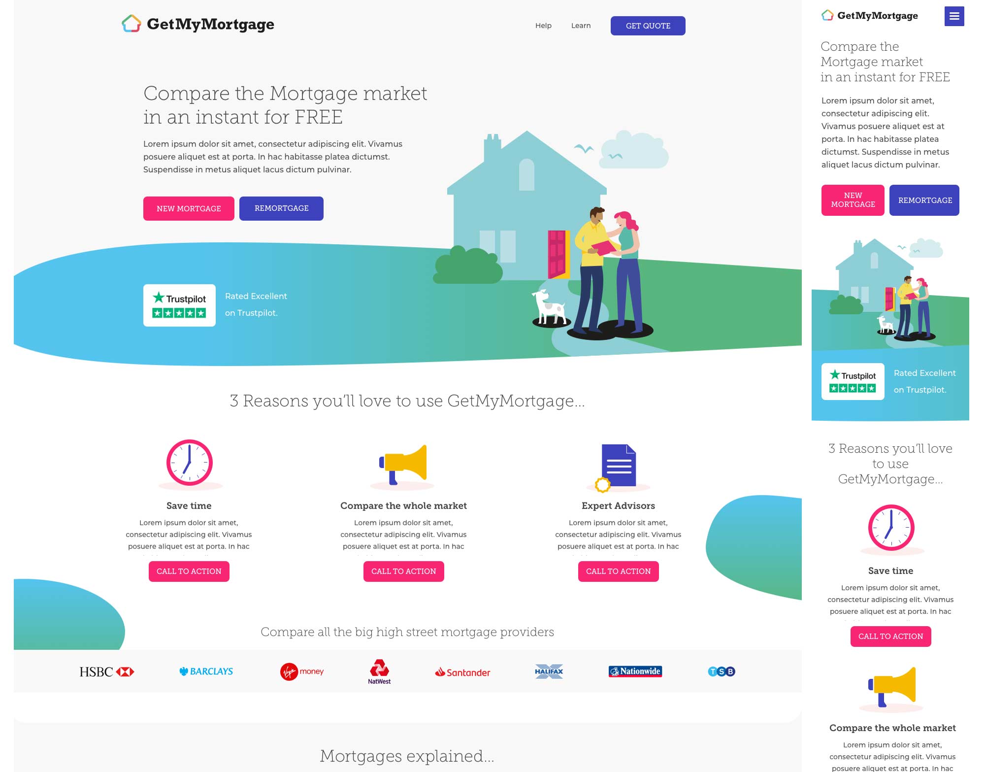
Solution
To follow

Completed UI (User Interface) designs
