How we took the data portal from an Excel spreadsheet to a sophisticated online application.

“…the most accurate picture of what is going on in Africa, based on data, not personal views or political bias.”
The Mo Ibrahim Foundation (MIF) exists to improve the governance and leadership in Africa and improve the quality of lives of all African citizens.
They seek to achieve this through a 4 key initiatives:
- Governance Weekends – Annual events in differing African countries, bringing together political and business leaders and stakeholders to debate critically important issues for Africans
- Prize for African leadership – awarded to former heads of state who have demonstrated exceptional leadership
- Fellowships – an initiative to mentor the future generation of outstanding leaders for Africa
- Ibrahim Index of African Governance (IIAG) – This data portal is a tool that measures governance performance in African countries
The Challenge
MIF were looking to employ a designer to look at three digital platforms:
- MIF’s main website – The main website for the organisation
- MIF.LIVE – A website dedicated to broadcast of live events and video streams
- The IIAG (Data Portal)
The site which I would like to walk you through here is the data portal, which was the most involved project in terms of UX and UI processes.
The Data Portal – what is it?
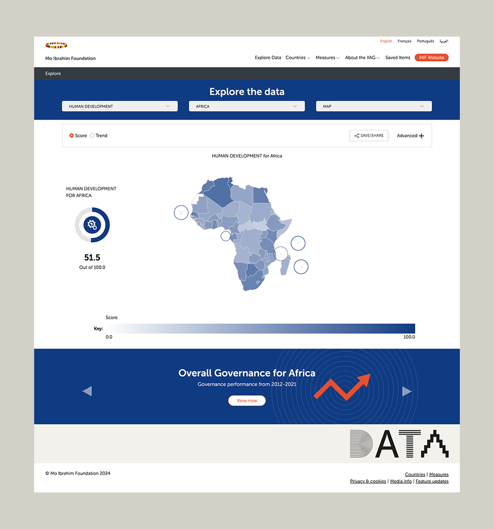
The Data Portal or IIAG (Ibrahim Index of African Governance), is a collection of governance performance data for Africa, which allows users to compare over 300 measures in numerous combinations.
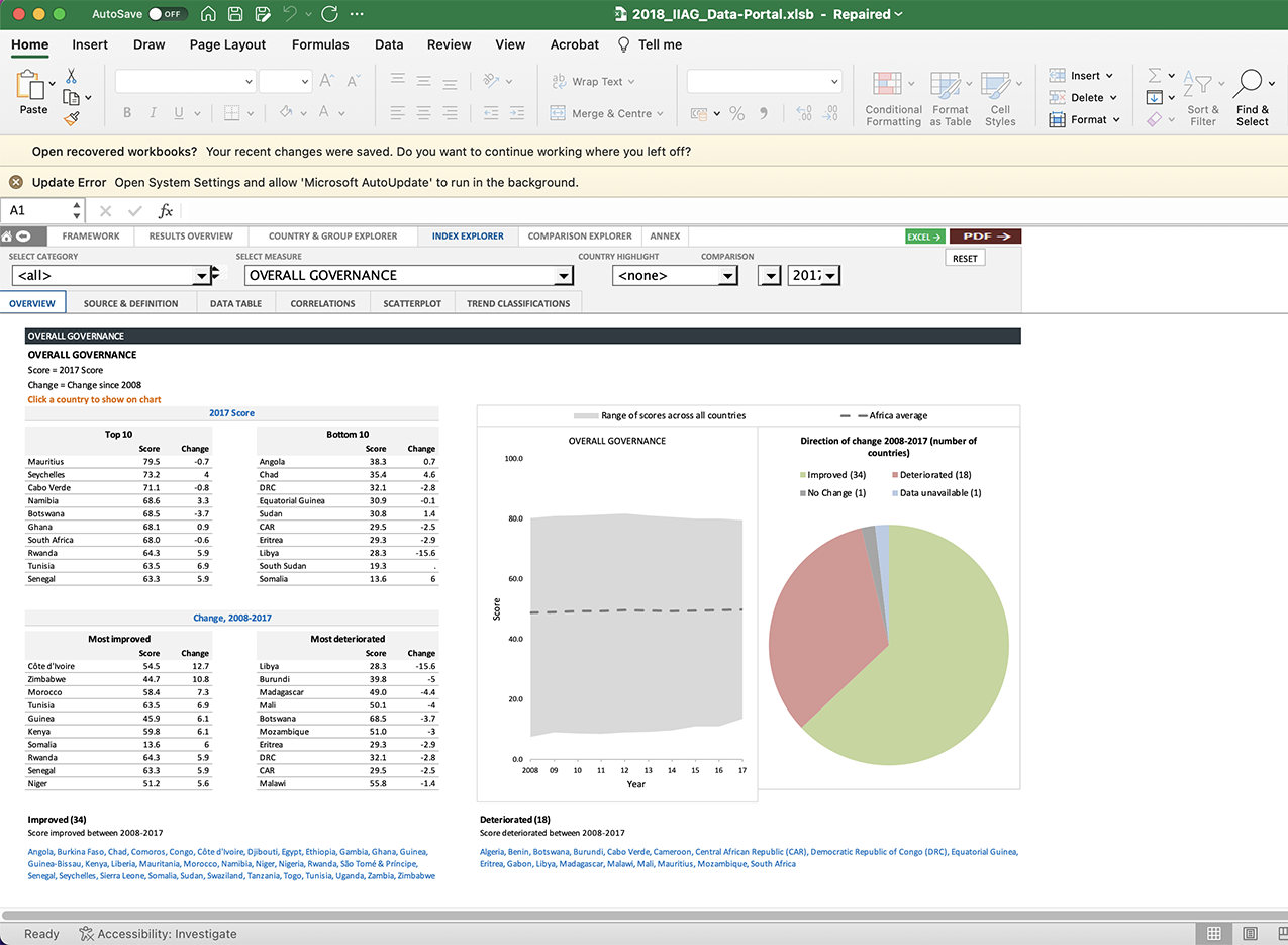
The Data Portal was initially created as part of an excel spreadsheet, using complicated formulas and macros in order for it to function.
It’s a classic case of a tool which served a good purpose initially, while it was small and manageable, but has become more difficult to maintain and use as it’s grown. As usage demand for the tool has increased, so has the call for it to be moved online so it can be accessed from any device as well as become a more intuitive user experience.
The Solution


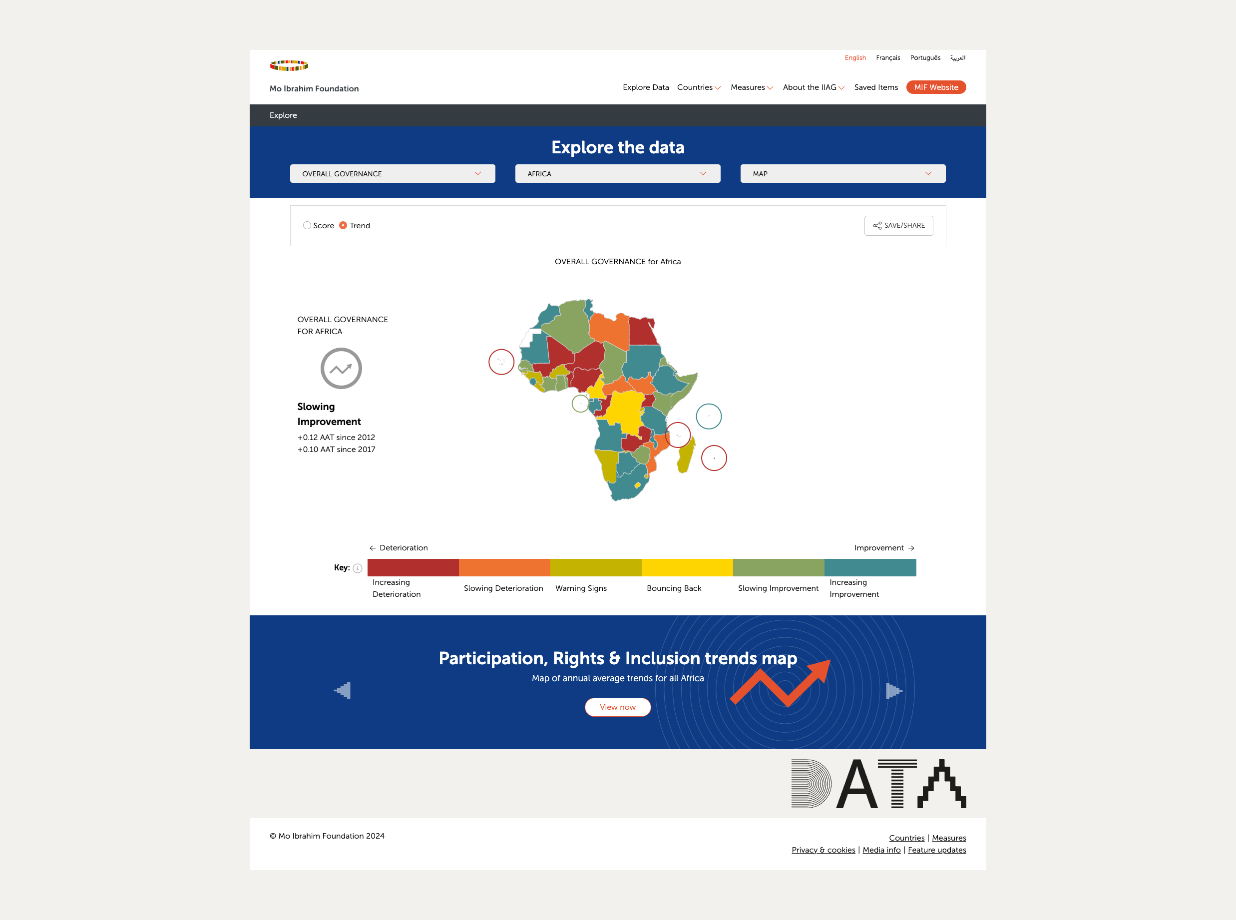
Here’s the project before work commenced and after the UI/UX design work (Drag the vertical slide bar to slide between designs).
A key step in the UX process for this project was to determine the level of functionality we were looking to achieve for the new Data Portal, compared with the Excel version. We went through a top tasks process in order to work this out, and also decided that some of the advanced functions in the Excel version were not required in the online version.

Once we had worked out the top tasks for the new version, I worked on creating basic wireframes for the site.

User Flow
Given the simple yet powerful capabilities of this tool, a user flow to show the journey was a crucial addition. Particularly for an on-boarding tool to educate users in how to use the tool

High fidelity designs
Full designs were created for desktop, tablet and mobile.

