How I helped Nimble to add extra features to their user friendly content creator.
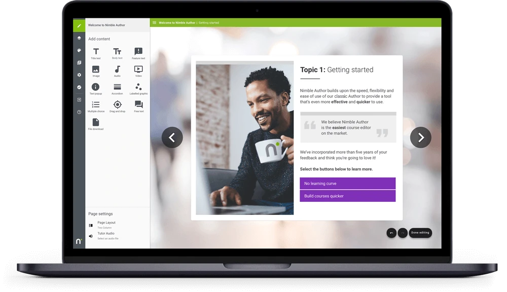
Making it super-easy to create engaging online courses and deliver them to your teams.
Project context
Nimble eLearning have created their own elearning software which, in their own words, ‘makes creating and tracking elearning super-easy, approachable and affordable’.
Their software is amazingly easy to use and intuitive, so that users with little to no experience can create learning software for their teams in a very short period of time. This is all backed up by first class customer support from a responsive and friendly team (Many of whom I’ve been lucky enough to work with in previous companies).
The Challenge
Nimble were looking to expand the functionality of their software, to allow users to introduce more variety and interactivity to their online courses.
These interfaces required UX and UI work from both the Author (teacher) and Learner (student) side of the table.
The main user interfaces that Nimble were looking to improve/ introduce were:
- Online surveys
- Course settings
- Special text feature
- Topic transitions
- Carousel interface
- Mandatory video
- Image reveal interaction
The UX process we went through for each of these design challenges were as follows:
- UX design brief – assessing where we are currently, and what needs to be done
- Creating an implementation ticket
- Producing acceptance criteria
- Making wireframes and prototypes – showing some potential options for review
- Creating high-fidelity designs
- Handover to development team
The Solution
Let’s look at the new image carousel interface as an example.
The Nimble authoring tool allows users to use a large variety of interactions, as you can see on the left side of the screen below. For instance – Images, videos, accordions and drag/drop features.
 Feedback from users strongly suggested that adding an image carousel to this offering so that users can easily scroll through multiple images, would be a welcome addition.
Currently only a static image was available to incorporate.
The first thing I designed was a new icon to allow the Author to add a carousel interaction to their pages.
You can see here, the icon for ‘Multiple images’.
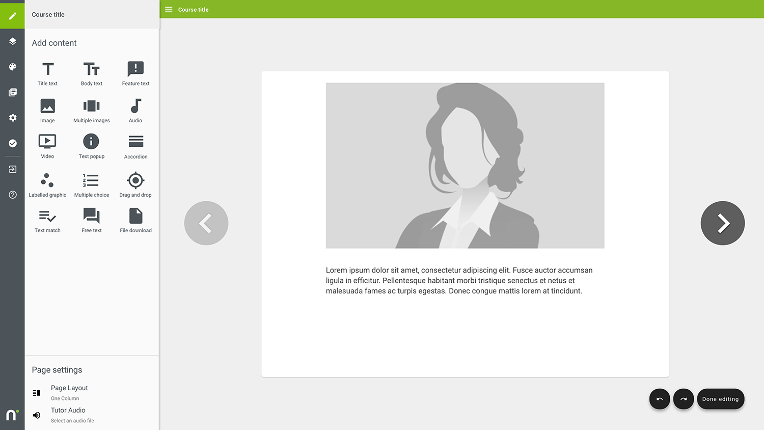 This name was chosen as we also wanted users to be able to add a static three column grid of images too.
Below is my design for settings page for adding a carousel item.
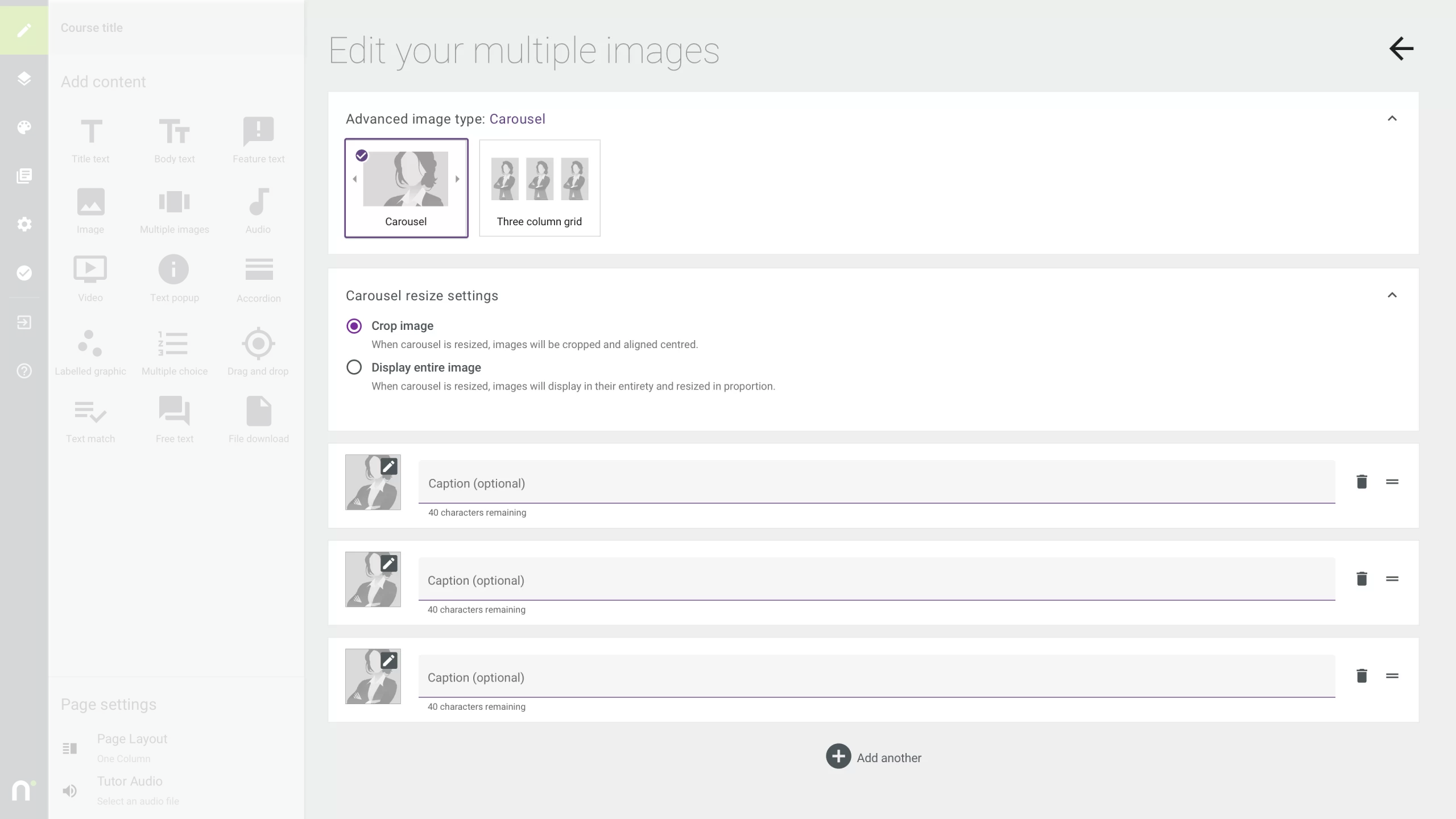 We added Carousel resize settings. This would allow users to choose whether to crop their uploaded images or to display those images in their entirety.
The interface also allowed for adding the images, captions (with a 40 character limit), as well as adding further images and changing order in which they appeared though a drag/drop mechanism.
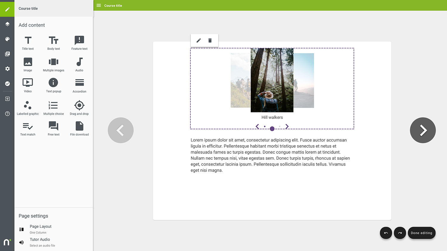
Here’s the carousel added to the page with the three images.
The dotted area is displayed as the user is resizing the carousel currently.
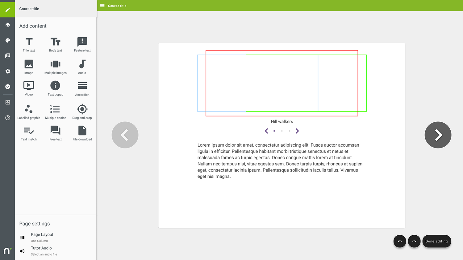
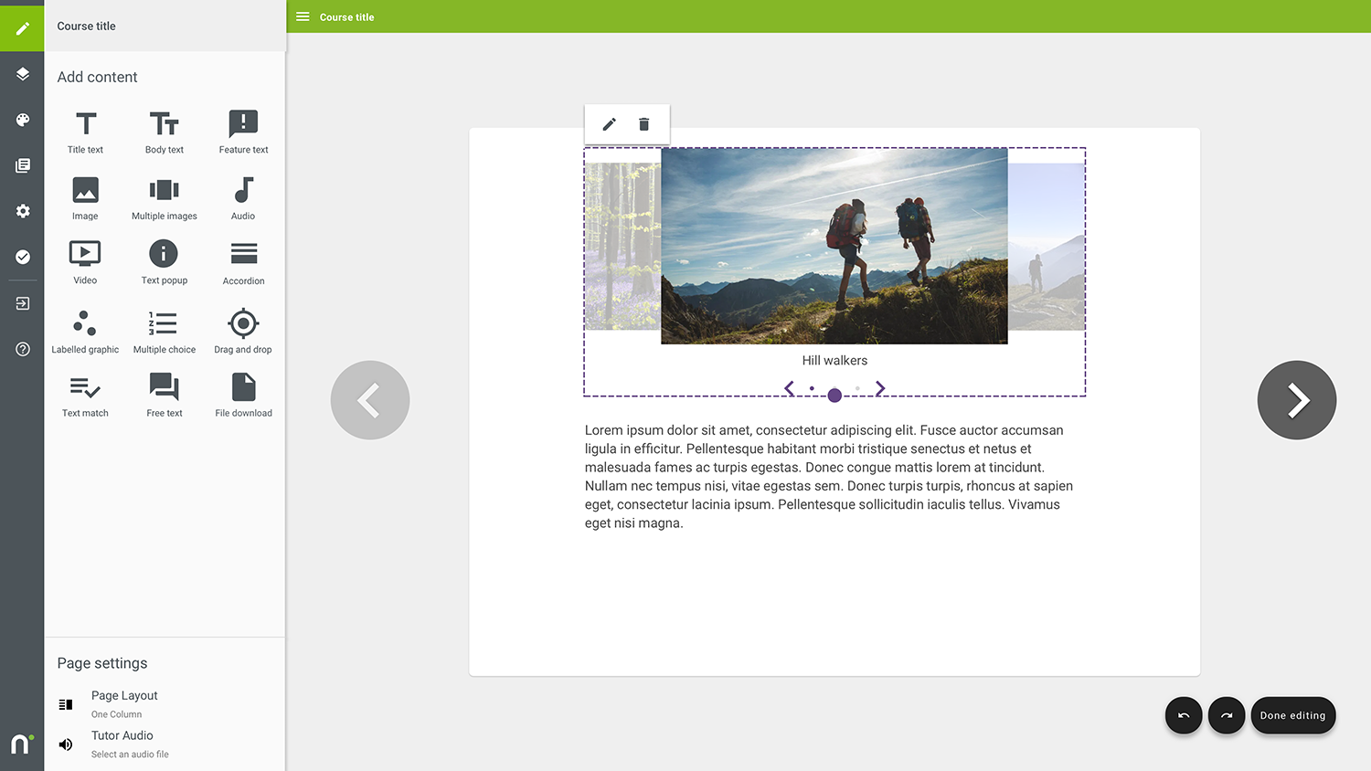 We had to look at cases where the user uploaded images in a variety of aspect ratios, as this could potentially make the carousel look awkward or even break the interface potentially.
 I defined crop areas for all images uploaded too. These had to work within the Material Design grid.
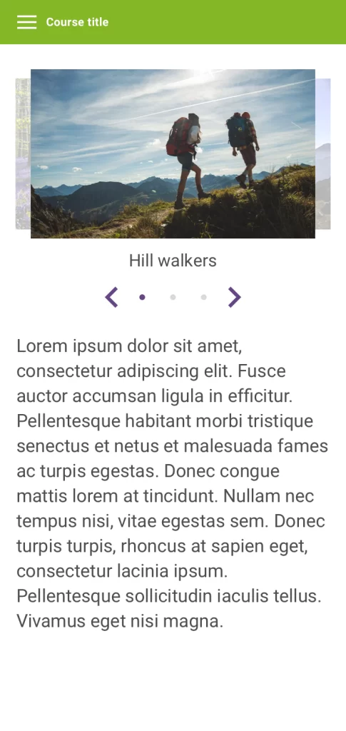
 We also looked at the user interface on mobile devices too – with and without captions underneath.
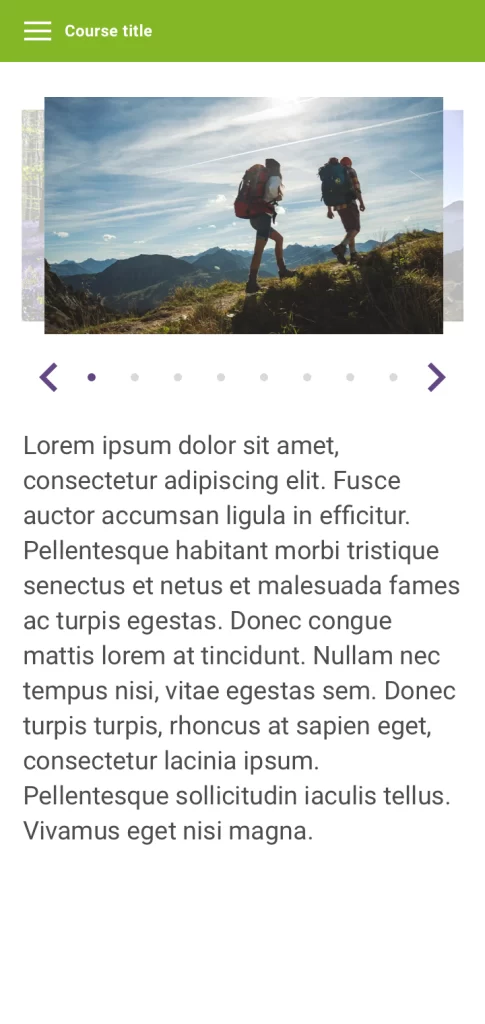
As well as working out the maximum number of images we could feature before space ran out to incorporate the arrows and progress buttons underneath (eight).
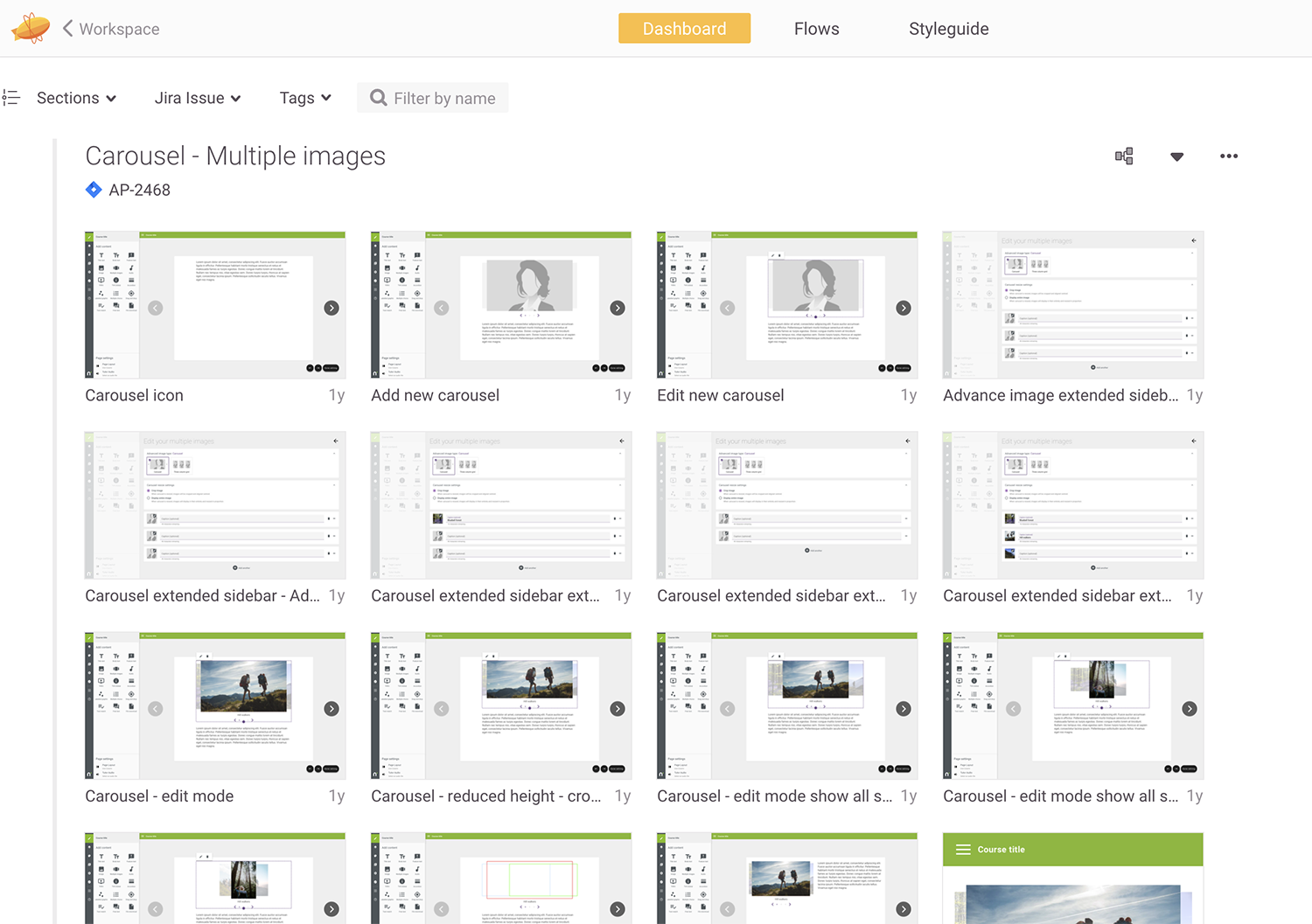
Handover for this project involved uploading signed off designs through Zeplin software. This ensured that the development team weren’t inundated with various design options and iterations, but could quickly and easily locate the current design versions.
What the client said...
”We have worked with Mark on numerous UI/UX projects, allowing us to upgrade and improve our Nimble Author software. This allows our users to benefit from a rich and intuitive user experience as they build their online courses.
Neil HydeManaging Director, Nimble eLearning.
